Ever notice how you can spot a favorite brand from a mile away? That’s the power of visual identity. In today’s loud marketplace, it’s what makes you stand out. A modern visual identity, especially a fresh logo with lively colors, is key to growing your business.
The Cornerstone: Understanding Visual Identity
Visual identity is more than just a pretty picture. It’s the whole package of how your brand looks and feels. It helps people remember you and builds trust. It’s your base to communicate with your audience.
What is Visual Identity? Think of visual identity as the face of your brand. It includes your logo, the colors you use, the fonts, and the images you show. These pieces work together to create a consistent look.
- Logo: The symbol people instantly recognize.
- Color Palette: The set of colors that represent your brand.
- Typography: The fonts you use in your materials.
- Imagery: The photos and graphics associated with your brand.
Why Visual Identity Matters for Businesses
A strong visual identity helps people remember your brand. It builds trust and sets you apart from others. When your look is consistent, customers know what to expect. This builds loyalty and makes your brand more recognizable.
Visual Identity vs. Branding: Clarifying the Difference
Visual identity is part of your branding. Branding is the overall feeling and message of your company. Visual identity is how that feeling is shown to the world. It’s the visual piece of your brand’s story.
Logo Design: The Face of Your Brand
Your logo is often the first thing people see. It needs to be modern, eye-catching, and memorable. Let’s dive into what makes a great logo.
The Importance of a Modern Logo: A modern logo shows that your business is current. It resonates with today’s customers. An outdated logo can make your company seem behind the times. Keep it fresh to stay relevant.
Choosing Vivid Colors: Making a Statement
Colors have power. They can make people feel certain ways. Pick colors that show your brand’s personality. For example, blue can show trust, while yellow can show happiness. Think about what feelings you want to evoke.
Logo Visibility Across Platforms: The Profile Picture Test:
Can people see your logo clearly in a small profile picture? This is the profile picture test. Your logo needs to look good, no matter the size. Make sure it’s simple and easy to see, even when tiny. This is especially key for social media.
Modernizing Your Visual Identity: A Step-by-Step Guide
Ready to give your visual identity a refresh? Here’s how to do it.
Conducting a Visual Audit: Assessing Your Current State
First, take a look at your current visual assets. What’s working? What’s not? Are your colors still on point? Does your logo look dated? Identify areas that need improvement. This will help guide your redesign.
Defining Your Brand Personality and Values
What does your brand stand for? What are your core values? Your visual identity should match these. If you’re a fun brand, show that through bright colors and playful images. If you’re serious, stick to clean lines and professional fonts.
Working with Designers: Finding the Right Partner
Finding the right designer or agency is key. Look for someone who gets your vision. Check their portfolio and see if their style aligns with your brand. Clear communication is vital for a successful project.
Implementing Your New Visual Identity: Consistency is Key
Once you have a new visual identity, use it everywhere. Consistency builds recognition. This means using the same logo, colors, and fonts across all platforms.
Creating a Style Guide: Your Visual Bible
A style guide is your rule book for visual identity. It includes your logo, color palette, typography, and imagery guidelines. Share it with everyone who creates content for your brand. This ensures everyone is on the same page.
Applying Your Visual Identity Across Marketing Channels
Your website, social media, and marketing materials should all reflect your visual identity. Use your logo consistently. Stick to your color palette. Choose fonts that match your brand’s vibe.
Training Your Team: Ensuring Brand Alignment
Make sure your team knows about your new visual identity. Explain why it’s important and how to use it. This ensures everyone represents your brand correctly.
Measuring the Impact: Tracking Your Visual Identity’s Performance
How do you know if your visual identity is working? Track your results.
Monitoring Brand Awareness and Recognition
Keep an eye on website traffic. Watch social media engagement. See how often your brand is mentioned. These metrics show if people are noticing you.
Analyzing Customer Perception and Feedback
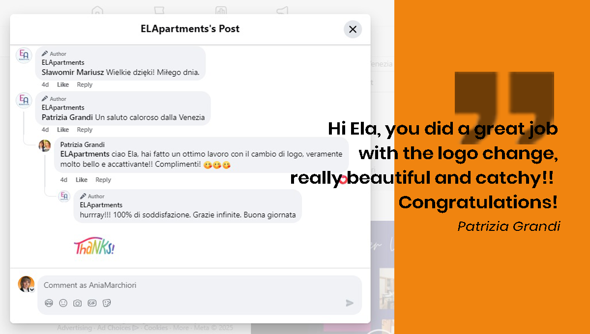
Ask your customers and friends what they think. Use surveys, reviews, and social listening. This feedback can give you insights into how your visual identity is perceived. There are many graphics experts who share their experience and are happy to give their feedbacks through social media platforms.
Tracking Sales and Conversion Rates
A strong visual identity can improve sales. Are more people buying your product? Are conversion rates going up? This helps determine if your visual identity is effective.
Reimagine Your Brand – Get a Modern Logo That Speaks!
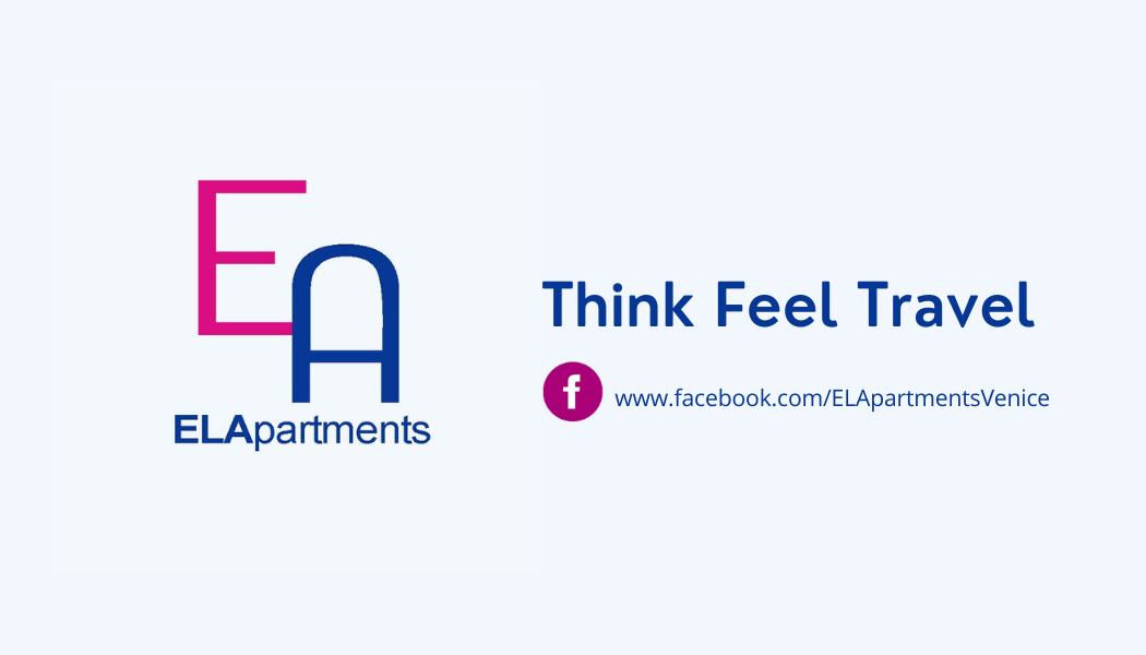
In digital marketing, colors play a crucial role in branding, user engagement, and emotional influence. Working on a new logo for ELApartments it was realised that Ela liked pink, dark pink and all shadows from pink to purple. It was a good indication and an idea for the primary color in her new logo. After studing the color schemes, running some tests, the code of values and perception was shaped and the decision was taken:
1. Magenta (Creativity, Innovation, Passion)
- Meaning: Represents creativity, innovation, and boldness. It’s often associated with transformation, imagination, and emotional appeal.
- Marketing Impact: Magenta grabs attention and conveys a sense of uniqueness and excitement. It’s often used by brands that want to appear cutting-edge, fun, or unconventional.
2. Light Blue (Trust, Calmness, Communication)
- Meaning: Symbolizes clarity, openness, and reliability. It evokes a sense of peace and professionalism while maintaining a friendly and approachable feel.
- Marketing Impact: Light blue is great for fostering trust and clear communication. It’s widely used in healthcare, finance, and tech, where credibility is key.
3. Dark Blue (Authority, Stability, Confidence)
- Meaning: Represents professionalism, security, and strength. Dark blue is often linked to intelligence, power, and trustworthiness.
- Marketing Impact: Used by brands that want to convey authority and reliability. It reassures customers and enhances brand loyalty.





ELA’s New Business Card

What do people think about the new logo?
A strong visual identity is a smart move for any business. It helps you stand out, build trust, and grow. Consistency and regular evaluation are key. It is an investment in your brand’s future.
New Logo, New Opportunities – Elevate Your Business Today!
