Why CTAs Matter More Than Ever
Explore what motivates users to click: urgency, clarity, value, and emotional triggers.
You’ve nailed the headline. Your landing page looks sharp. Your email is on point. But what if your call to action (CTA) falls flat? All that effort might go to waste and you might not see the results.
CTAs are where clicks happen. They turn interest into action – and ultimately drive conversions. But writing a CTA that actually works? That’s both an art and a science. Let’s break down how to craft high-converting CTAs that feel natural, perform well, and inspire people to take that next step.

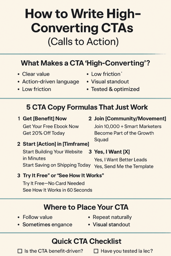
What Makes a CTA “High-Converting”?
A high-converting CTA does more than just ask someone to click. It creates clarity, urgency, and confidence.
Here’s what the high-converting CTAs have in common:
- Clear value — People should know what they’re getting.
- Action-driven language — Strong verbs beat passive ones.
- Low friction — Remove hesitation (“Free,” “No credit card required”).
- Visual standout — It shouldn’t blend into the background.
- Tested & optimized — The best CTA is rarely your first draft.
5 CTA Examples That Just Work
Let’s skip the fluff—here are proven CTA formats that convert across websites, emails, and ads:
1. “Get [Insert Here Benefit] Now” – It’s direct, focused on value, and uses urgency to prompt action
- Get Your Free Ebook Now
- Get 20% Off Today
2. “Start [Action] in [Timeframe]” – Gives a sense of speed and simplicity—great for SaaS, ecom, or tools.
- Start Building Your Website in Minutes
- Start Saving on Shipping Today
3. “Try It Free” or “See How It Works” – Reduces commitment fears. Perfect for trial-based products or explainer content.
- Try It Free—No Card Needed
- See How It Works in 60 Seconds
4. “Join [Community/Movement]” -Social proof + community vibes = trust and belonging.
- Join 10,000+ Smart Marketers
- Become Part of the Growth Squad
5. “Yes, I Want [X]” (Conversational CTA) – Mimics internal dialogue. It feels like you made the decision.
- Yes, I Want Better Leads
- Yes, Send Me the Template

Where to Place Your CTA for Maximum Impact
Copy is key, but placement matters too. CTAs perform best when:
- They follow value. Don’t slap a button at the top—build context first.
- They repeat naturally. Include a CTA more than once (start, middle, end).
- They stand out visually. Use contrast, whitespace, and clean design.
Bonus tip: In emails, buttons usually outperform text links, but both have their place.
Real CTA Test Results – In case you like numbers (who doesn’t?):
- Changing “Submit” to “Get My Free Quote” increased clicks by 28% for a service-based business.
- Replacing “Buy Now” with “Try Risk-Free for 30 Days” boosted conversions by 19% on an ecomm checkout page.
- Adding urgency (“Today Only”) lifted email click-through rates by 14% in a split test.

Before you hit publish, ask yourself:
- Is the CTA benefit-driven?
- Is it action-oriented and specific?
- Does it lower friction or hesitation?
- Is it easy to see and easy to click?
- Have you tested at least one variation?
Next Step: Start Testing Your CTAs
You don’t have to guess which CTA will convert best—test it. Run A/B experiments on:
- Button text
- Color & design
- Placement on the page
- First-person (“Get my guide”) vs. second-person (“Get your guide”)
Small changes = big impact when it comes to CTAs.

A CTA isn’t just a button or a link – it’s your moment of truth. It’s where curiosity turns into action. A tiny piece of copy with a big job to do. Write it with intention and attention. Test it with data and always focus on the value you’re offering.